


Special thanks to our Software Engineers Ziad Soobratty, Pam De Silva and Dan Walsh and our UX/UI Designer, Sarah Jones. We’re grateful for their double-time contributions both in kick-starting the development of our Global Component Library and sharing their time and thoughts to help write this blog.
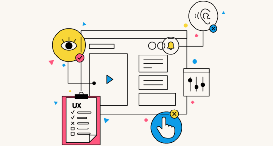
One of the ongoing technological developments we’ve been working on is implementing a global component library (GCL), known as ‘Honeypot UI’. For those less familiar, a GCL is a collection of user interface (UI) elements like buttons, form fields and navigation bars that can be reused by different teams across different projects. It provides us with our very own customised ‘off-the-shelf’ selection of UI elements that our teams can choose from for their next project without having to build them from scratch each time.
It’s perhaps a little like browsing a shopping aisle and making a simple off-the-shelf choice between the pre-made brown squares or honey-coloured hoops for your next bowl of cereal. It also saves our developers from crying into said bowls of cereal at the thought that they’d otherwise need to rebuild a component from scratch - again.
The growing need for a Global Component Library
The idea for Honeypot UI was floated many years before it became a reality. But like so many competing priorities in any business, this one didn’t get the traction needed to take off in earnest at the time.
Over the years, we’ve introduced some elements that would eventually help shape our broader GCL. When we started migrating our UK web app to use the React front-end framework, we started with the ‘Plans’ page that sits inside the BeeHive (a customer’s online account), and the BeeHive’s ‘Support’ page, followed by the ‘Documents & Resources’ section. During this, we adopted the Storybook UI development tool to build the UI components separately, which created the seed for our component library. So, we recognised the benefits standard components could bring, but it was all a bit piecemeal initially.
As our ambitions around the React migration grew, we saw the need to up our GCL development game. The need for a single component library also became more acute as the business expanded into the US market. We soon found our US and UK teams were building separate components, resulting in two versions of each. The long-term downsides of having mismatching components were evident, as well as the challenge of keeping the various libraries properly synchronised.
Empowerment to contribute
To date, it’s been easier for our teams to consume components from the library than it has been to contribute to it. But those are two different scenarios requiring different management processes.
Every component submitted to the GCL gets reviewed to ensure it meets our design and functionality standards before it’s approved for adding to the library. But we’re looking to distribute more knowledge throughout our teams to foster their empowerment to contribute to it.
So far, our US team has moved forward with a solid governance approach for their library, which existed prior to creating a global library. New components were created and submitted for review, seeking design sign-off before being added to their library. This provided some useful experience when we took the decision to create a single library for all teams. Should a team identify any issues or wish to extend a component’s functionality, that team will need to create a separate version of that component that undergoes its own discrete review before being accepted into the main library.
We want to avoid having just a few gatekeepers, which could create a bottleneck preventing contributions. Anyone and everyone can and should feel they can contribute to the GCL. However, we need to strike a balance between enabling the freedom to contribute to the library and safeguarding its quality.
Currently, the GCL’s management is fairly centralised. Contributions are reviewed and managed by a core team. This made sense initially as they’d come through to the group involved with setting up the library. But we’re moving to a place where more teams are empowered to manage and approve contributions for their needs. We’re taking inspiration from the global Open Source software movement, which has demonstrated that software projects can be successful and maintain high quality even when anyone can contribute changes.
There are several PensionBee ‘hubs’ - interest groups made up of designers and developers. These hubs can function as the owners of shared code, operating the governance of internal open source projects, reviewing and approving contributions, and expanding knowledge and empowerment over the GCL.
Implementation challenges
Like any new venture, we’ve encountered a fair share of hurdles. Some of which we’re still chewing over. Here are a few of the challenges we’ve found so far.
Keeping pace with our roadmap
As we work towards our product development goals, we’ve encountered the challenge of updating Honeypot UI at a pace that works for our team’s project needs at the time they’re working on them. This very much highlights the need for our governance to be distributed and effective, as covered above.
Competing ideas
Differing views on what’s needed for a project can lead to creating multiple versions of the same component. Although we can make components with multiple variants, the question of whether every new variation is a justified long-term addition to the library is debatable. We want teams to be able to self-serve with what they need for a project; equally, we’d like to avoid the library becoming a Wild West of barely used components that nevertheless require maintenance.
Tightening the feedback loop
To help teams feel confident in contributing, we need to better understand what each one needs from the library. This means having clear communication of requirements between those who want to add or suggest improvements to the library and those who oversee how it’s set up in the first place.
How we’ve been using our Global Component Library
Developing and adopting Honeypot UI across our teams has led to several exciting changes we (and ultimately our customers) benefit from.
Ensuring component consistency
Designers can perform visual quality assurance more easily. We use Chromatic, a visual testing and review tool, that allows us to connect our design tool, Figma, with our component library that is implemented using Storybook. Designers can easily identify any discrepancies between the designed and coded components. Plus, updating a component in Storybook automatically pulls in the change across our linked systems. Shout out for the rather elegant cross-tool collaboration there, too.
Enforcing accessibility standards
Now we’re cooking with accessibility standards baked into our components (last food analogy, I promise). This puts accessibility considerations on a par with other elements of component development rather than being an afterthought. It acts as a fail-safe, so components are always shipped with an inherent baseline of accessibility.
Chromatic helps us here, too. It includes an accessibility dashboard, which flags violations, making it easier for our teams to identify and address these up front.
‘Props’ and component flexibility
Components are configured using React ‘props’ (properties). We can write unit tests to ensure components will render in the intended way. If a component’s design or behaviour was extended in the future, our tests would flag any changes in the new version that break the original component’s design or functionality. This testing helps ensure all components adhere to the quality standards we set.
We’ve built flexibility into our components that can satisfy competing standards or preferences. As a rather niche but important example, accessibility guidelines require HTML heading tags not to skip levels in the hierarchy - an H1 has to be followed by an H2, not an H3 (this also impacts screen readers and keyboard navigation). However, we may want to style an H2 as an H3 (which is usually smaller). Thankfully, through the use of props, we can use an H3 component to convey semantically what we intend, but use a prop that tells the component to use an H2 element in the HTML, avoiding compromising accessibility
Reaping the rewards across the board
Despite being in the early stages of implementing a GCL, we’re already seeing the benefits.
For our developers
- Empowerment to build pages more quickly through ready-to-use components.
- Increasingly less need to address the same predictable issues like component accessibility and responsiveness.
- Faster development times.
- Working on projects is more enjoyable. Components can be easily chosen and installed with less testing and configuration.
For our designers
- Increased confidence designs are implemented as intended.
- Design review time is reduced as standardisation of elements is baked in from the start.
- More space to focus on user journeys instead of user interface (UI) elements.
- Only needing to review a component once.
- A single source of truth for UI standards.
For our customers
- A more consistent experience across every PensionBee product.
- Faster delivery of new features.
- Accessibility is built in from the start, improving usability and creating a more inclusive product.
- Cohesion in look and feel makes for an easier and more enjoyable product to use!
Stewarding the future of the Global Component Library
As adoption of our GCL grows, so will the challenges. But they’re exciting challenges because of the benefits the GCL gives us. Here are a few areas we’ll need to tackle to help the GCL work for everyone.
- Increasing adoption across all application UIs.
- Developing documentation on how to contribute to the library, what to do if a component breaks, etc.
- Continuing to develop mature components, e.g. building in key accessibility features, ensuring they’re responsive, etc.
- Tracking and reviewing proposed changes, like resolving design mismatches and accessibility violations.
- Distributing knowledge on how to use and contribute to the GCL to all potential contributors.
Honeypot UI is more than a collection of buttons and form fields. It offers a way of working that brings our designers and developers closer together. And this collaborative approach to development enables us to move faster and ultimately deliver more reliable, inclusive, and enjoyable experiences across our products for our customers.
Period | Market Event | FTSE World TR GBP (%) | 4Plus Plan (%) |
|---|---|---|---|
4Plus Plan’s inception – 6 Sept 2013 | QE Tapering, China Interbank Crisis and its aftermath | -5.44 | -2.41 |
3 Oct 2014 – 15 May 2015 | Oil price drop, Eurozone deflation fears & Greek election outcome | -5.87 | -1.77 |
7 Jan 2016 – 14 Mar 2016 | China’s currency policy turmoil, collapse in oil prices and weak US activity | -7.26 | -1.54 |
15 June 2016 – 30 June 2016 | BREXIT referendum | -2.05 | -1.07 |